
Earth Pigments for Artists
Many artists get frustrated when mixing colors - a lot of artists talk about “making mud” and so shy away from earth-based pigments, preferring instead to seek out modern pigments with higher and higher chroma. (High chroma is fun - but it’s not the only way to create exciting color!) But if you mix your colors cleanly and carefully manage value, a broad world of color opens up within the earth pigment range.
Earth colors initially look brown, red, yellow - low chroma, but when you understand their tendencies and control the mixes, you can squeeze a ton of color out and create subtle shifts of warm and cool.
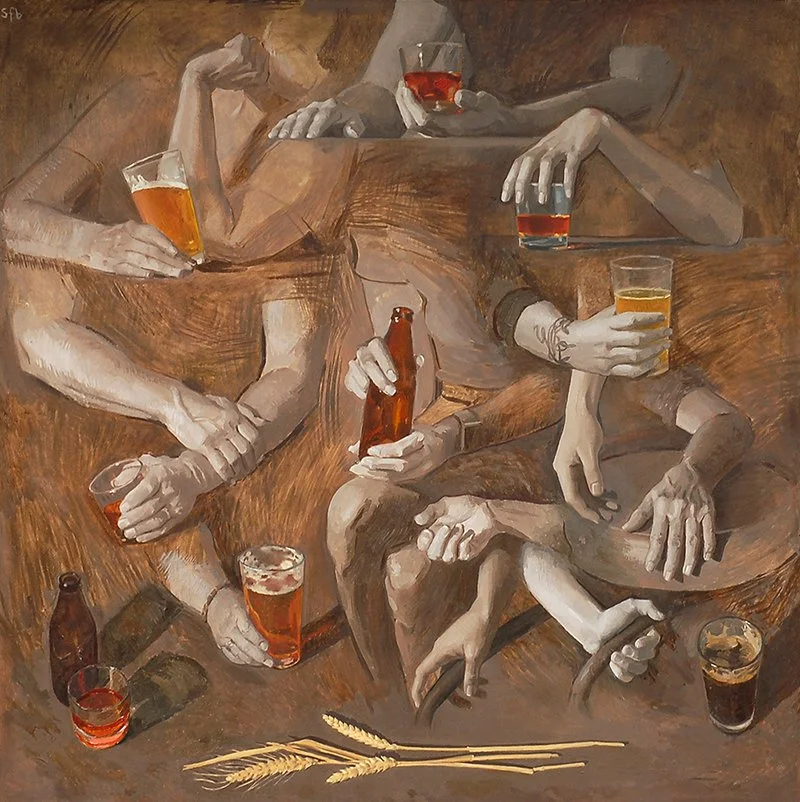
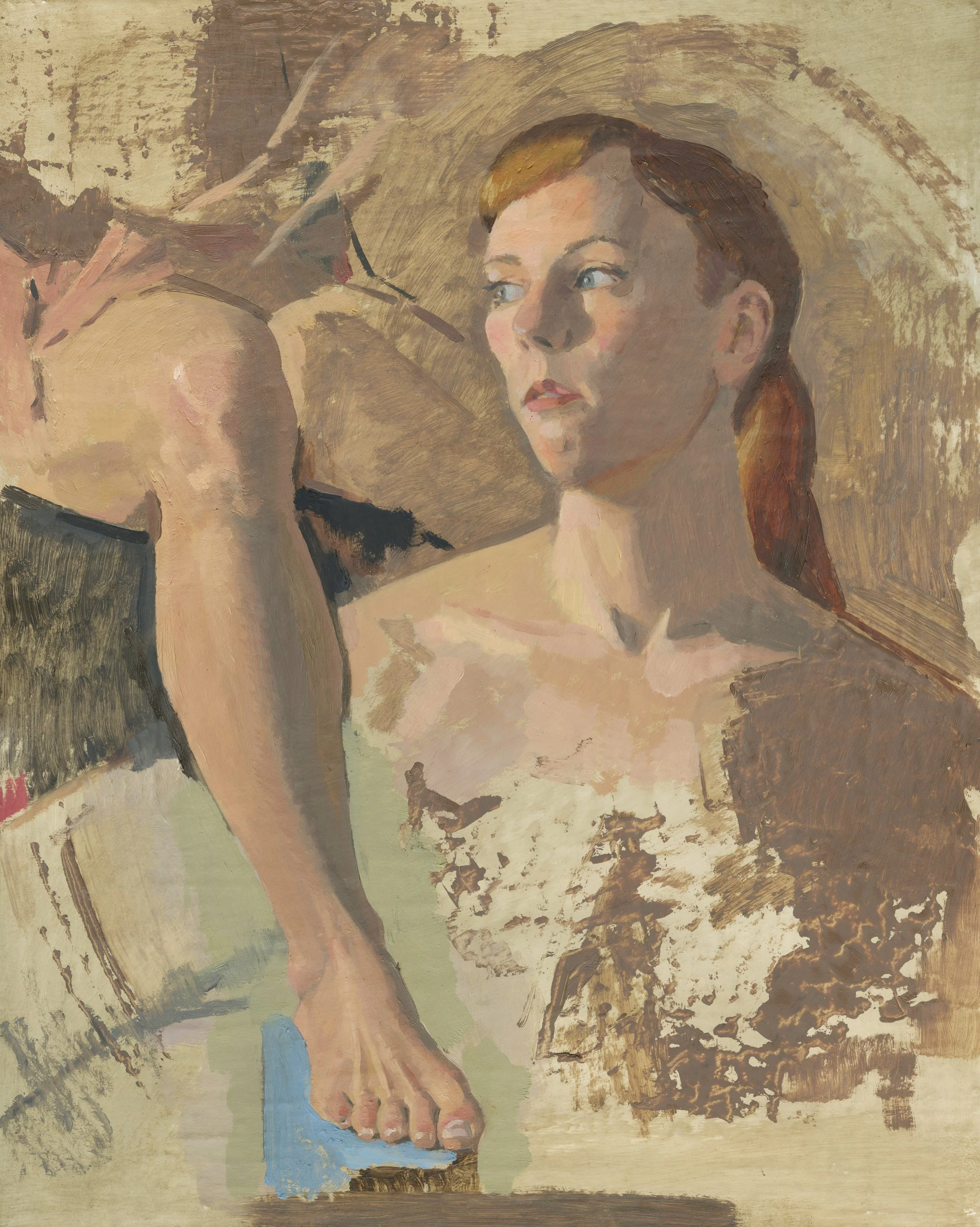
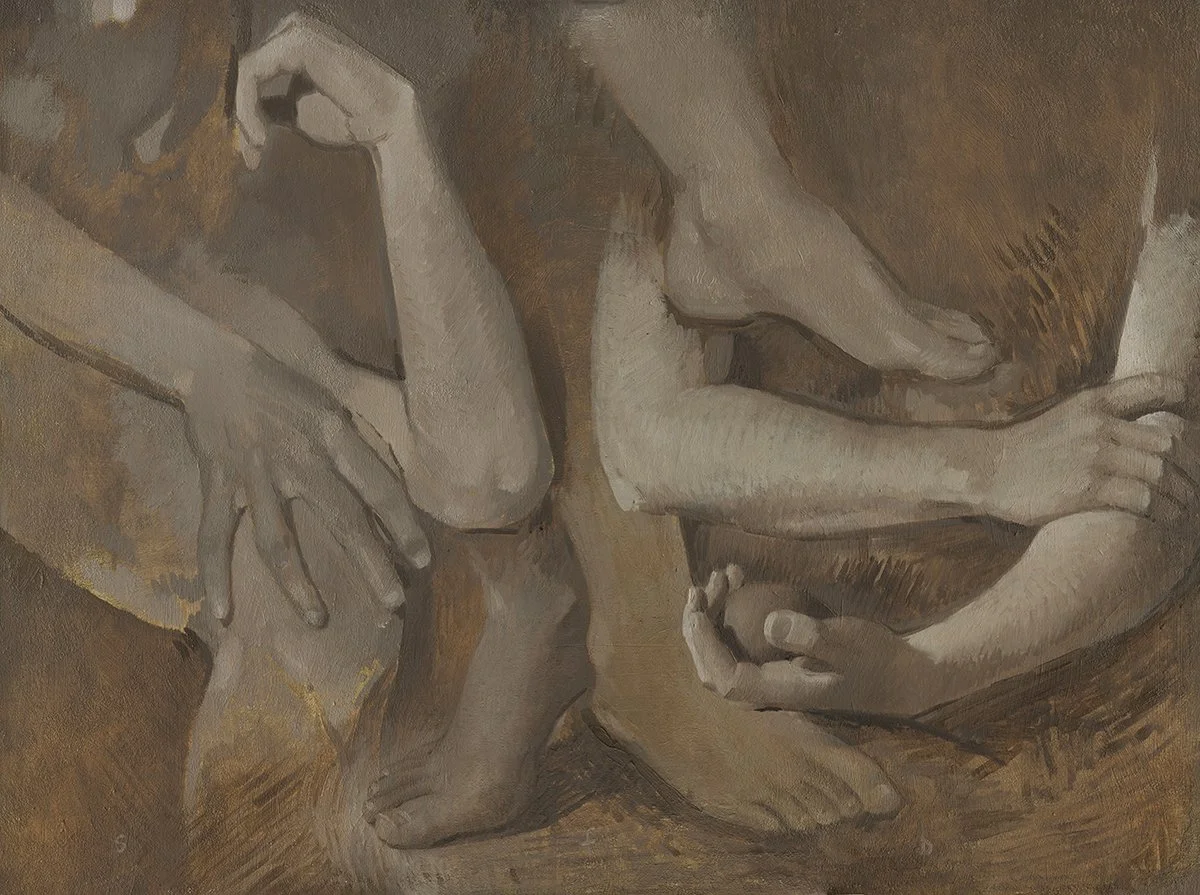
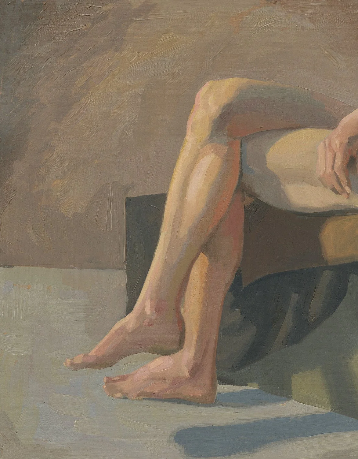
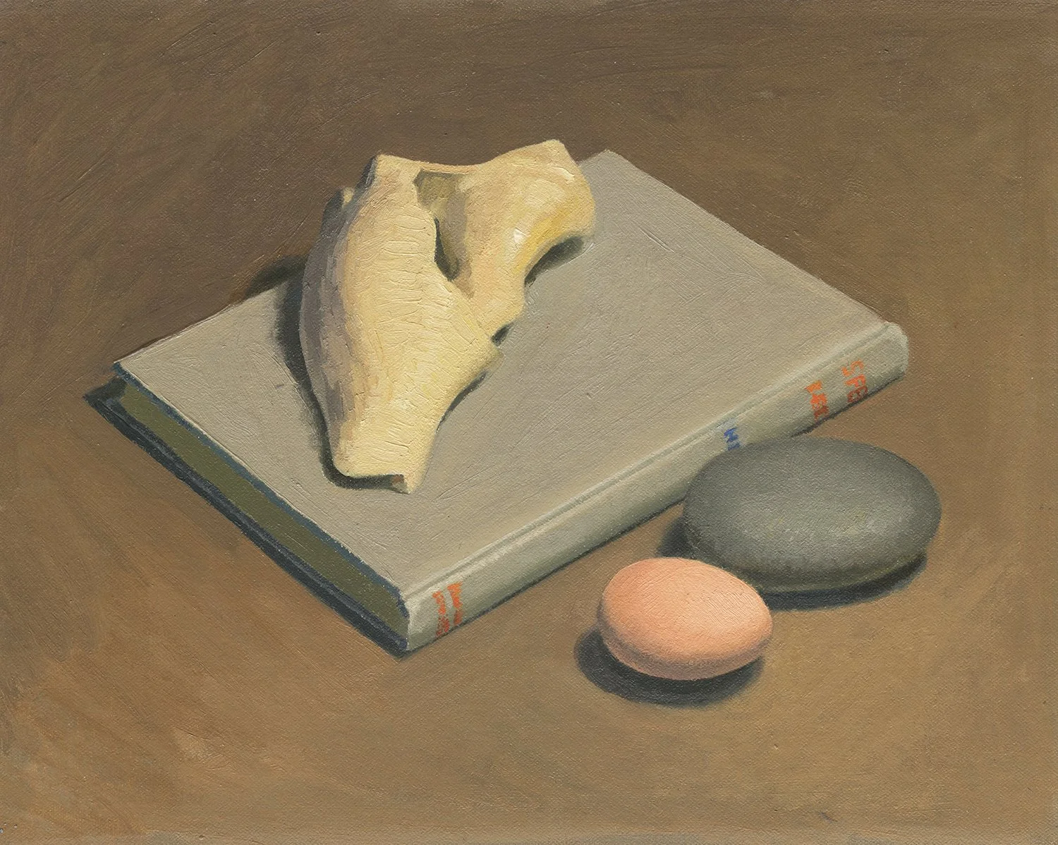
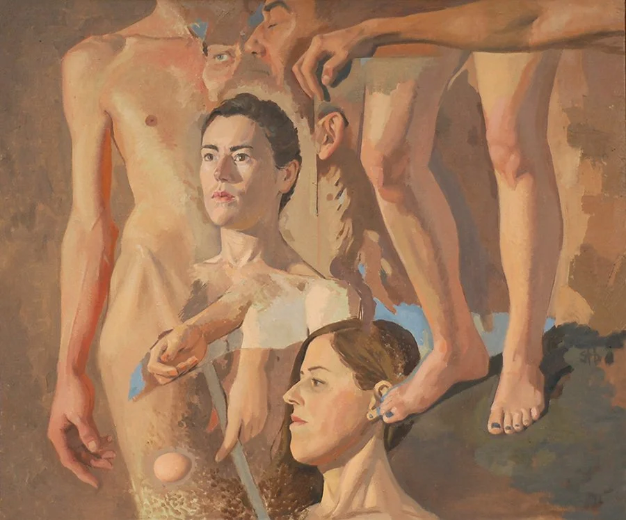
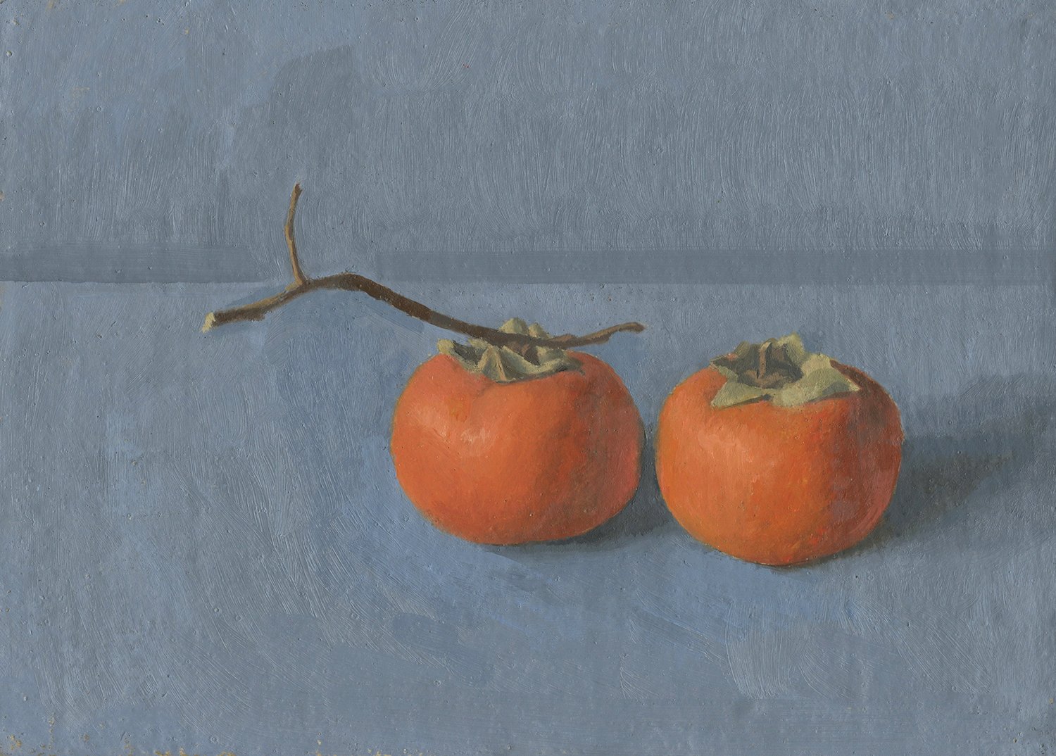
Below is a body of work where I explored using a limited palette of primarily earth colors.
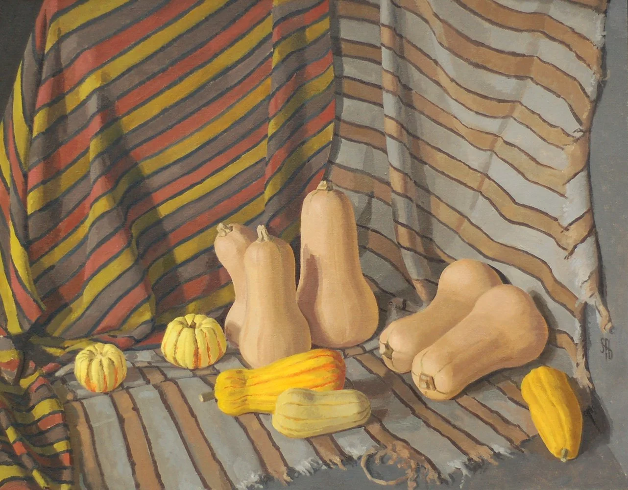
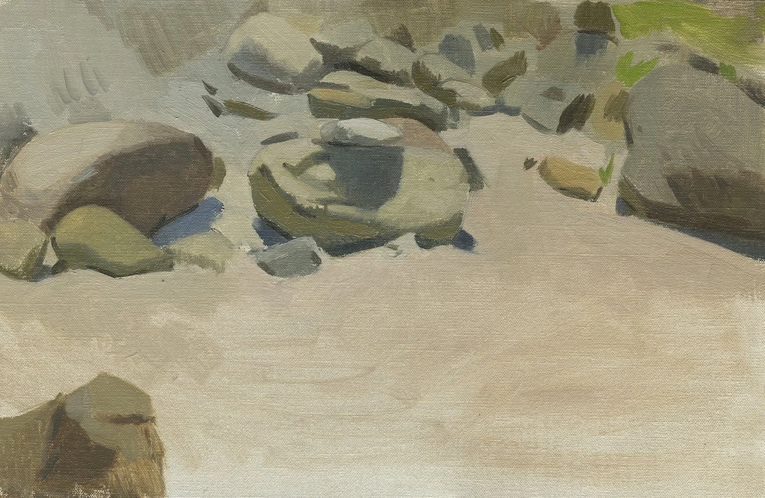
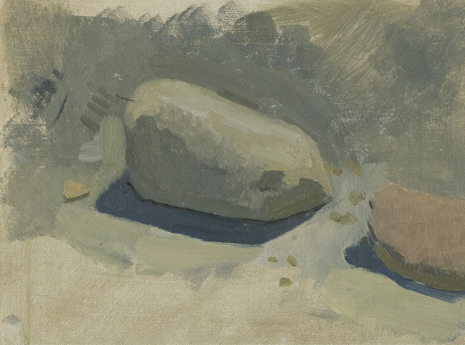
I love earth colors. They are largely overlooked. Most of us are initially very attracted to high chroma, modern colors. But earth colors have extraordinary staying power. The renaissance is built mostly on earth colors. Cave paintings are made with earth colors. Earth colors have been used in every part of the globe. There is a weight and majesty to earth colors that no other colors compare to.
Yet many artists don’t have many, or any, earth colors on their palettes. There is an arts education myth that you could mix better neutrals by using two color “opposites”. This method drives me crazy because it changes the color you’re mixing too dramatically. If you want to lower the chroma of a color it’s SO much easier to grab a lower chroma version of the same color and gently add that to the high chroma version. There are earth colors in nearly every hue, so it’s super easy to use them to adjust other higher chroma pigments.
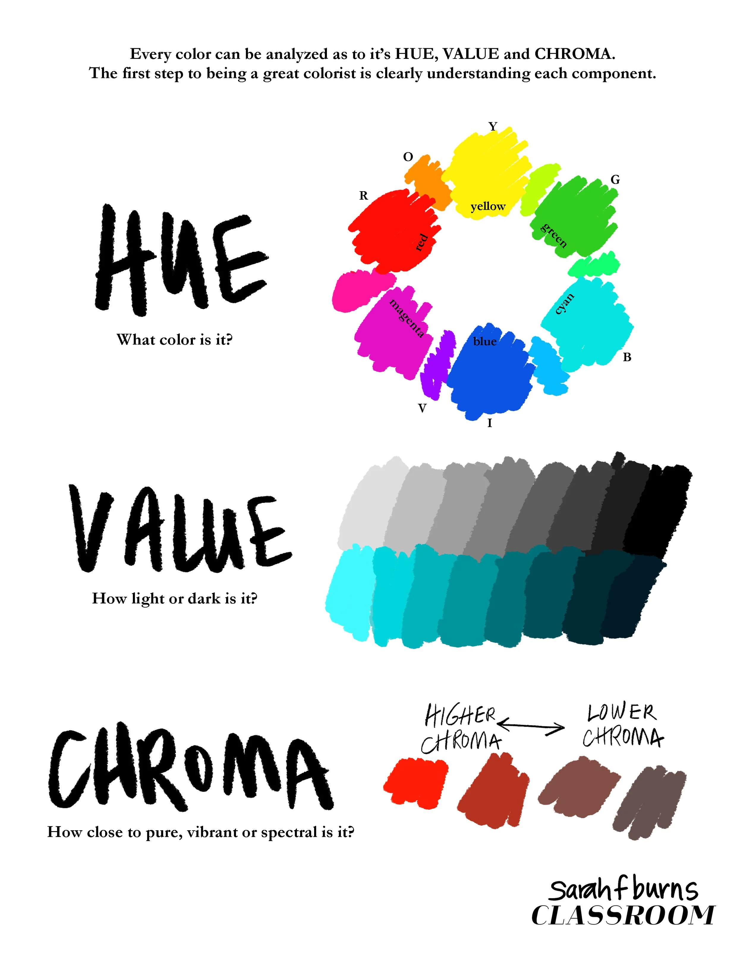
Being able to clearly define Hue, Value and Chroma is the first step toward being able to handle color well in your paintings.
This is an elegant solution for so many reasons. Besides being a gentle and more manageable way to adjust color, it’s cheaper. Earth colors are generally inexpensive and are less fugitive than higher chroma pigments. To me it’s a no-brainer.
It's also a fun challenge to play with earth colors when you know that color is relative - meaning - colors change depending on what they’re placed next to.
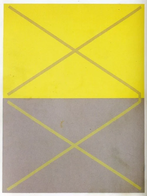
The appearance of colors can change depending on what colors they are placed next to. Josef Albers shows many examples like this in his book.
From Interaction of Color
by Josef Albers
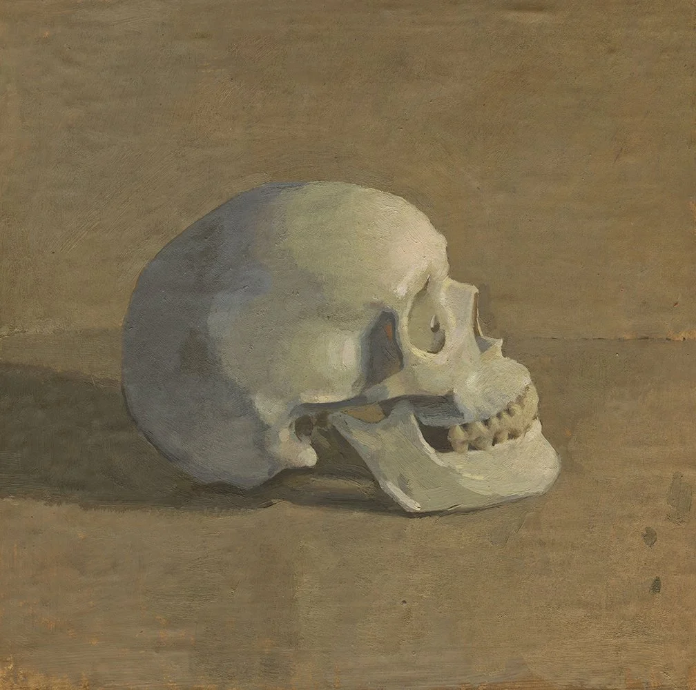
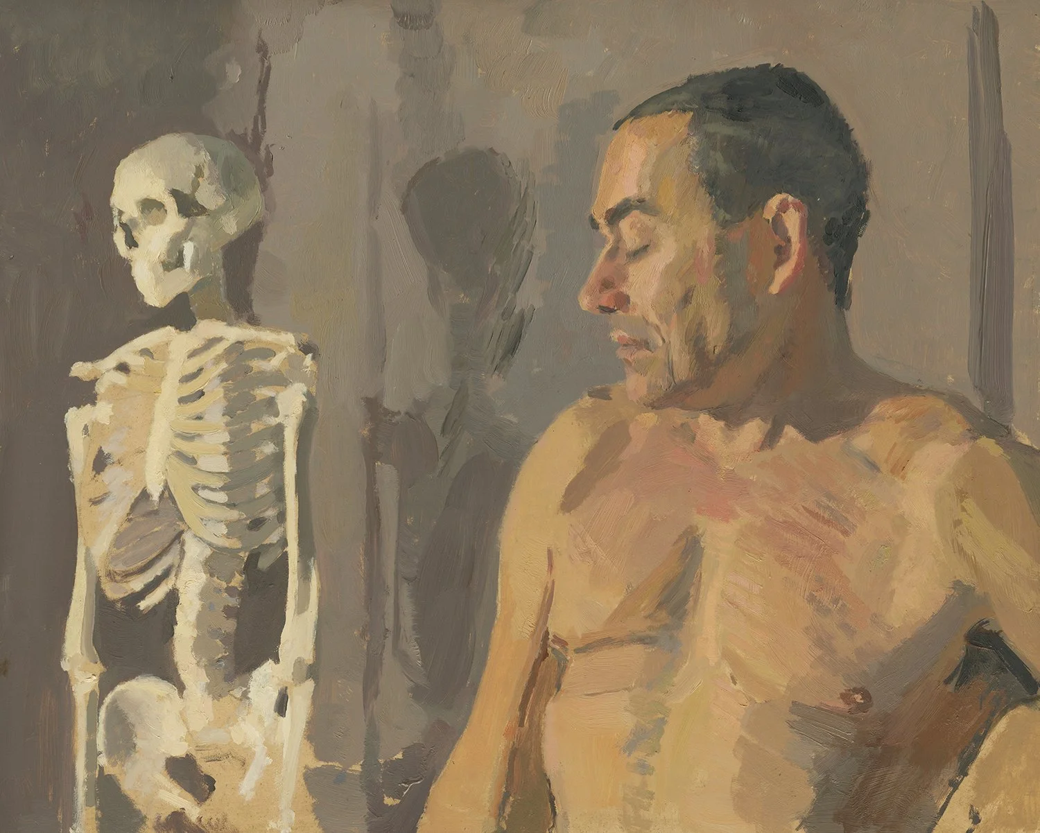
I learned a lot of this from one of my favorite painting teachers, Ben Fenske. He gave us the exercise commonly known as the Zorn Palette , where artists use just four colors - white, red, yellow ochre and black, in order to mix as many colors as possible. The idea is that a limited palette will help you learn to get the most out of your pigments. You learn what’s really necessary. You learn to focus more on value and shifts of warm and cool. You learn to limit the pigments in your mixes. When you understand how color works, you will find you don’t need a lot of pigments in a mix to get the effect you desire.
Artists from past centuries didn’t have the vast number of high chroma colors that we have now and they could still created impactful work. If artists today train themselves to understand color better, they can gain control of what can be a very unwieldy, overwhelming and confusing amount of color. In fact access to high chroma pigments hasn't helped everyone!
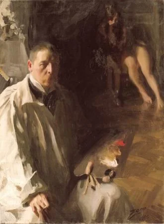
Anders Zorn
This self portait, which shows four colors on Zorn’s palette - Lead white, Yellow Ochre, Vermillion and Ivory Black inspires thousands of artists to do a painting exercise today referred to as “Zorn Palette”. This painting can easily be made with just these four colors. Many artists today swap lead white for titanium white and vermillion (made with mercury) with cadmium red light.
One of the biggest takeaways I had from the “Zorn Palette” exercises was that Ivory Black plus White creates blue, which in the absence of a higher chroma blue, looks very blue! (If you use Titanium White, the blue effect is even stronger.)
The paintings below don’t use any actual blue pigment, but rely on ivory black plus titanium white, surrounded by warm colors to create the illusion of a higher chroma blue. Granted - it is subtle, but it’s a ton of fun to play with and you can get rich, harmonious colors with extraordinary longevity.
Do you want to learn more about color mixing and how to harness the power of earth pigments? Stay tuned for my painting class - The Science and Practice of Color. I’ll be teaching it live in autumn of 2026.